
Let’s break it down in simple terms, examine why it matters, and learn how to apply Hick’s law in your design work.
What is Hick’s Law?
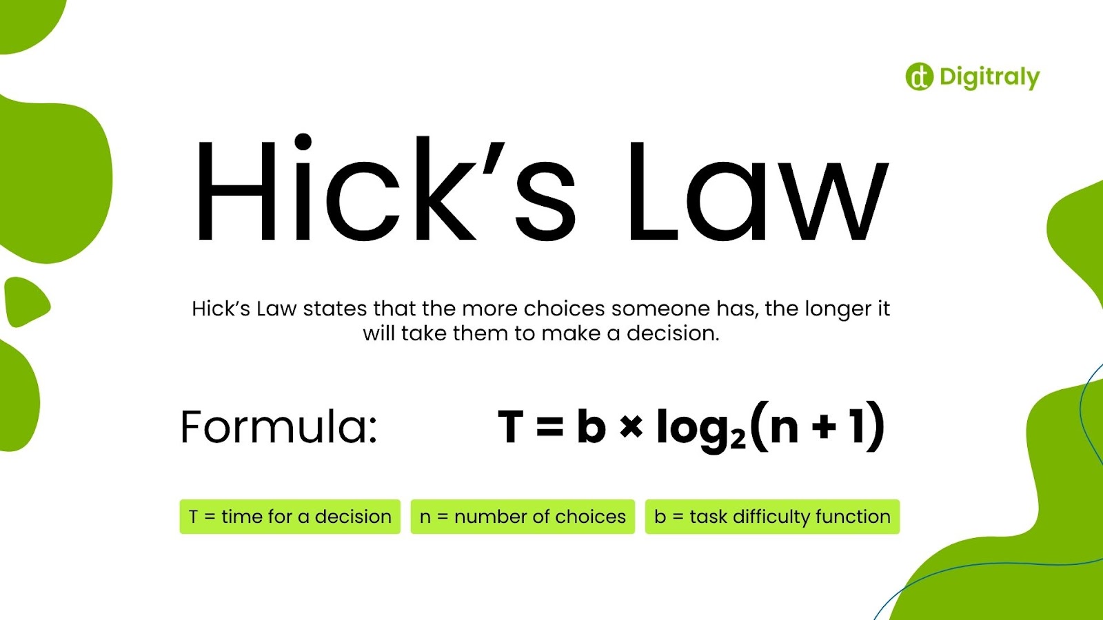
Hick’s Law states that the more choices someone has, the longer it will take them to make a decision. Sounds obvious, right? But when you’re deep in the design process, it’s easy to forget that piling on options doesn’t help—it slows things down.
This principle isn’t just a theory; it’s rooted in research by psychologists William Hick and Ray Hyman, who mathematically demonstrated how decision speed decreases when more options are available. To users, this means that too many buttons, links, filters, or features lead to decision fatigue.
Logarithmic formula:
T = b × log₂(n + 1)
Where:
T = time for a decision
n = number of choices
b = task difficulty function
That math equation illustrates how doubling the options doesn’t double the time—it does so in a decreasing manner. However, when speed and readability are paramount (as in UX), even minor latencies can confuse the experience. Hick’s Law explains why simplicity and specificity in interface design lead to faster, more informed user choices.
Why It Actually Matters in UX
People don’t visit apps or websites to admire how many cool features you’ve crammed in. They come to get something done—and they want to do it fast. Hick’s Law helps remind us to keep it simple, clear, and focused.

Here’s why it’s important:
1. Faster decisions mean happier users.
Users dislike delays. Clear, simple choices speed up decisions, reduce frustration, and lead to smoother, more enjoyable experiences with better outcomes.
2. Simplicity over complexity.
Simple action and clear design allow people to move with confidence. Uncertain paths lead to uncertainty and lower the likelihood of completing critical tasks.
3. Improved conversion rates.
Concentrated designs guide users to a specific point. Less distraction enhances focus, heightens engagement, and translates into greater conversions in sign-ups, buys, or interactions.
How to Apply Hick’s Law to Your Design Projects
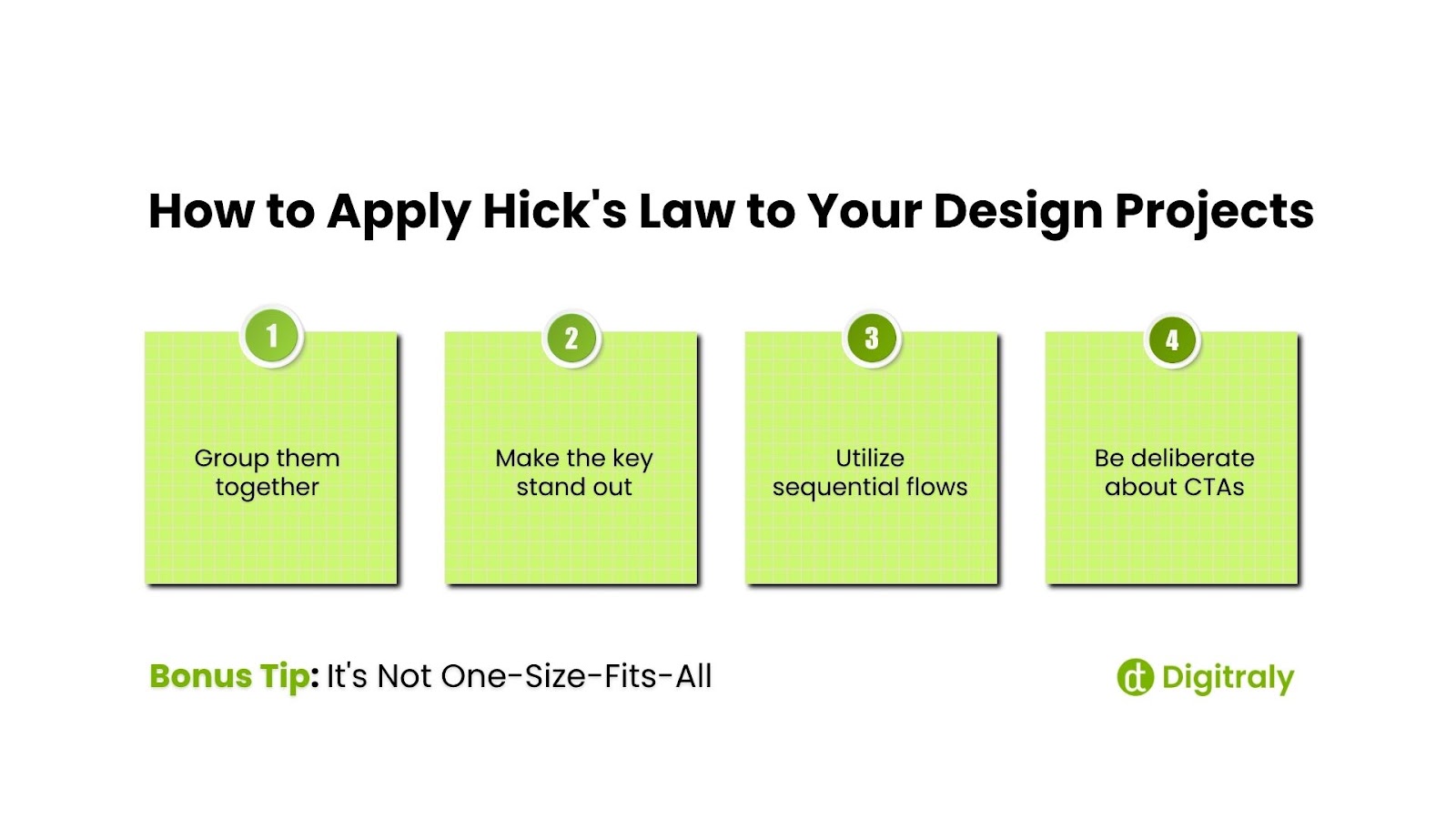
It’s not so much about removing choice as it is about presenting the right choice at the right time. Here are a few ways to accomplish this:
1. Group them together
Don’t present all filters or options at one time. Present them in groups so users can quickly scan and drill deeper if they want to.
Example: Clothing store product filters—by size, color, and price, rather than listing 25 at once.
2. Make the key stand out
Prioritize the most-used or most-critical actions. Let the others recede into the background until required.
Example: Simple onboarding pages with a single “Get Started” button rather than 3 or 4.
3. Utilize sequential flows
If a task has steps, break it down into smaller components. Display one step at a time to avoid overwhelming the user.
Consider: A checkout process with obvious steps—cart, shipping, and payment—instead of a single, huge form.
4. Be deliberate about CTAs
One clear call-to-action is preferable to three weak ones. If everything is competing for attention, nothing will be heard.
Think: On a home page, use a single CTA, such as “Try it Free,” rather than a row of choices, like “Learn More,” “Subscribe,” “Buy Now,” or “Compare Plans.”
Bonus Tip: It’s Not One-Size-Fits-All
Now the interesting stuff. Hick’s Law is a useful rule of thumb, but it’s most effective when considered in context.
- In high-stakes situations, provide users with fewer options. Don’t complicate things for them when speed is of the essence.
- For power users, more advanced options may be very useful. Please give them the ability to customize or modify their experience.
In other words, always consider who you’re designing for and what they’re trying to do. A new user and a power user have very different needs.
Final Thoughts
Hick’s Law teaches us that excellent design is not about providing everything—it’s about providing just the right amount. By recognizing how decision time increases with each additional choice, UX designers can create quicker, more engaging experiences that users appreciate and enjoy.
We’re believers in purposeful design—at Digitraly, simple isn’t minimal but meaningful. We help teams simplify complex interactions, reduce mental load, and build digital products that respond to real human behavior.
If your goal is a smarter, cleaner, and more intuitive experience, let’s work together to achieve it. Reach us now.